I'm a full-stack developer that is passionate about good user interfaces. In my newsletter, I talk mainly about UI/UX stuff. You could expect an email or two in a month, I'm not aiming to spam you with non-useful info.
CSS & Accessibility
|
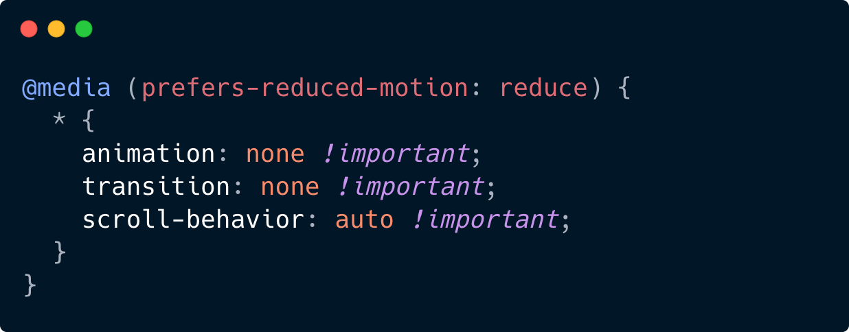
Here is a quick recap of all CSS prefers-* queries that you can use to adjust to user settings. Prefers Reduced Motion (95.57% global support)Indicates whether the user prefers less motion to avoid VIMS - Visually-Induced Motion Sickness. Here we disable any animations or transitions, but we can be flexible here (e.g., REDUCE motion but do not disable it completely)
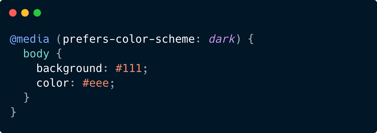
Prefers Color Scheme (95.16% global support)Detects whether the user prefers a light or dark color theme. In this example we change the styling if the user prefers the dark theme.
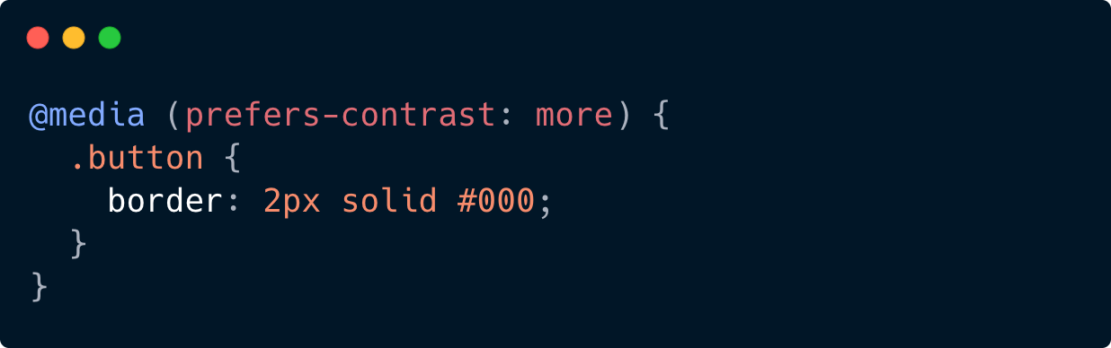
Prefers Contrast (92.68% global support)Indicates the user prefers higher (or lower) contrast between elements.
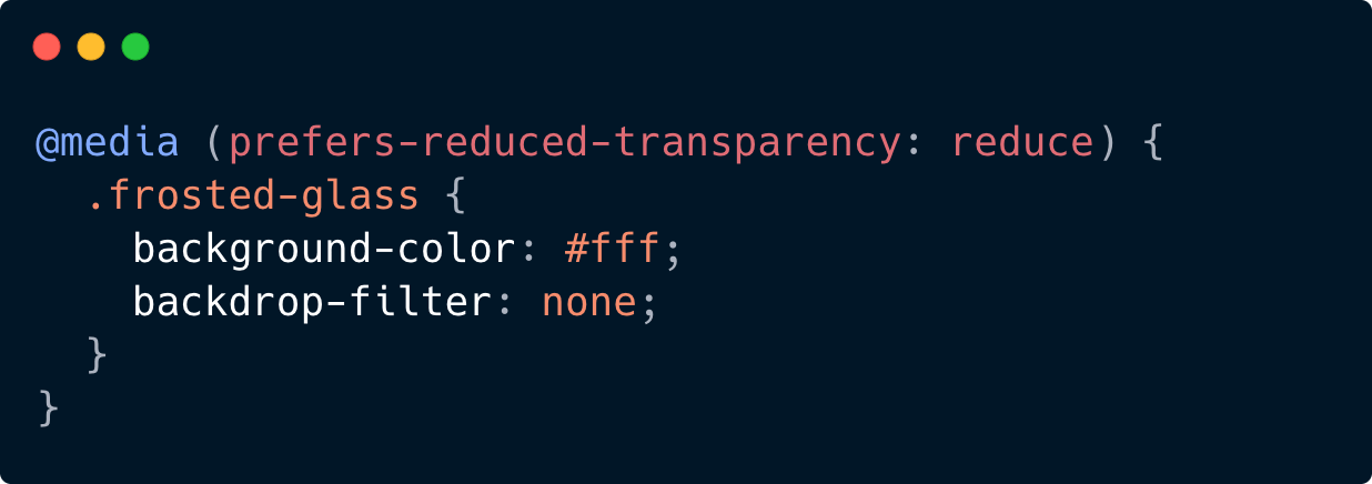
Prefers Reduced Transparency (73.15% global support)Tells us if the user prefers less transparency (e.g. no glassmorphism, hello new iOS design 👋)
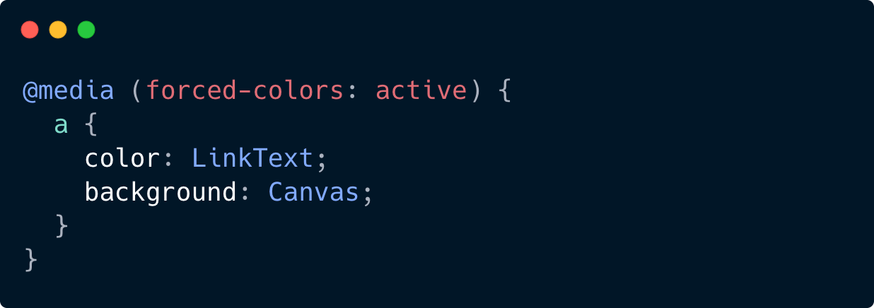
Forced Colors (92.86% global support)Used to detect if the user agent has enabled a forced colors mode where it enforces a user-chosen limited color palette on the page.
An example of a forced colors mode is Windows High Contrast mode. Bonus TipYou can conditionally load external files like This way you:
Another cool example — you can load different images (animated or static) based on the user's preference: You can use
If your page uses a lot of animations — using this technique can be a big win for accessibility and performance. Thank you, |
Victor Ponamariov
I'm a full-stack developer that is passionate about good user interfaces. In my newsletter, I talk mainly about UI/UX stuff. You could expect an email or two in a month, I'm not aiming to spam you with non-useful info.

Live and learn. Either CSS is developing so fast, or I'm so slow, but I feel like I knew 80% of CSS in 2015, and now I know at most 50%. Today we'll talk about env function in CSS. Yeah... there are environment variables in CSS, just like in NodeJS 🤯 The env() CSS function can be used to insert the value of a user-agent defined environment variable into your CSS. The syntax is simple: env(<environment-variable>, <fallback>) But what kind of environment variables do we have and how can we use...
When I first dived into the topic of colors, it seemed to me that I was at least studying nuclear physics. It still does, though. 😅 Disclaimer: I might have some inaccuracies in this article. Sometimes I used definitions provided by Google AI, because it was challenging for me to convey/explain the ideas with precise words. But mostly there are links and definitions from Wikipedia and other resources. There are many notions and abbreviations: CIE 1931, RGB, sRGB, HSL, CMYK, Oklab, LCH, OKLCH,...
There is the grayscale filter in CSS that can make your pictures completely grayscale. It's useful when you want to show a bunch of logos, making them grayscale by default, but when you hover over them, they become colorful. But! Another trick is to use grayscale on the <html> tag. This way you can look at your app from a different perspective and see how it looks without colors. This is useful if you want to see what draws users' attention most, whether such elements as links, buttons, and...